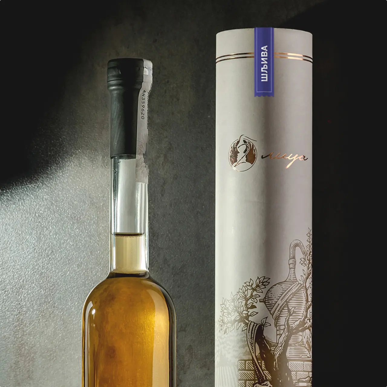
Where wine, rivers, and tradition meet a single mark
Logo & Visual Identity that helped transform a local event into a recognizable, high-end experience. A design system built to work seamlessly across every touchpoint and leave a lasting impression.
Where tradition becomes an experience
“Ukusi Morave” is a gastronomic and tourism event that brings together some of the region’s finest producers, from wine and rakija to honey and authentic local food.
At its core, the event celebrates tradition, diverse tastes, and a distinct regional identity. Through tastings, education, and curated experiences, it connects producers with visitors, building a culture around enjoying food and drink, not just consuming it.
“Stefan perfectly blended our region’s tradition with modern design; clean, timeless, and clearly reflecting authentic quality.”
Our Challenge
How should the logo and visual identity look?
How to make the event recognizable and, more importantly, desirable to both exhibitors and their customers? How to position it as a high-end destination? Not just another local fair.
My Role
To design a Logo and Visual Identity that brings together tradition, geography, and gastronomy. And positions the brand accordingly.
A timeless fusion of tradition, geography, and gastronomy
The logo that merges five elements into a single, cohesive symbol:
• The letter “M”
• A traditional Serbian cap
• Three rivers
• A wine glass
• The letter “U”
The result is a symbol that feels both rooted and refined. It translates seamlessly across formats, materials, and environments.

Inspired by Wine
With wine as the central focus of the event, red was the natural choice for the primary brand color.
It serves as the foundation across all touchpoints: from digital and print materials to the clothing worn by the “Ukusi Morave” team.
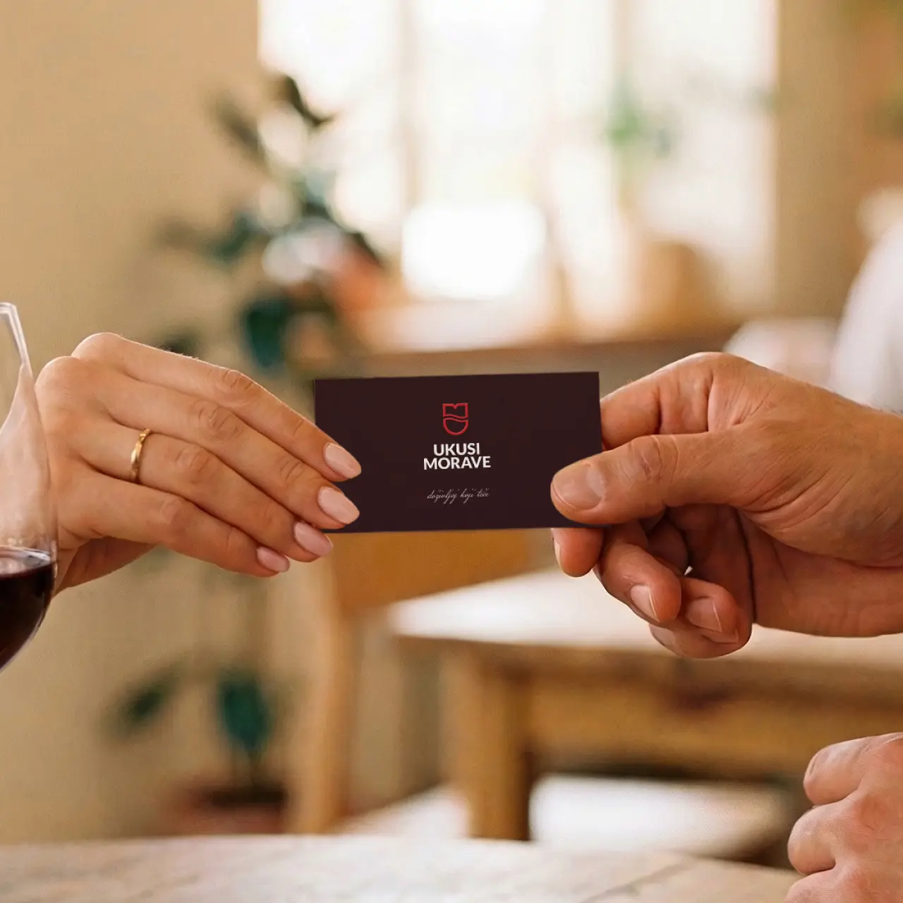


Designed to be seen. And felt.
The brand lives both online and offline.
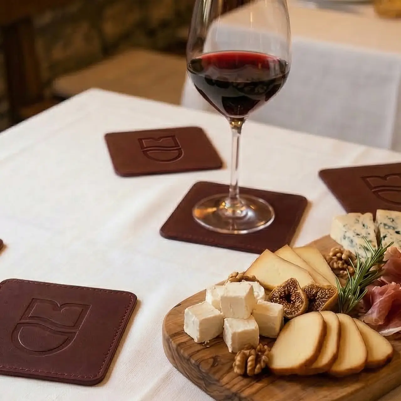
Invitations are sent physically. A deliberate choice that adds weight to the experience. Materials matter: textured papers for letters and envelopes, embossed leather coasters, stitched symbols on flags.
Details that don’t just communicate. They stay with you.
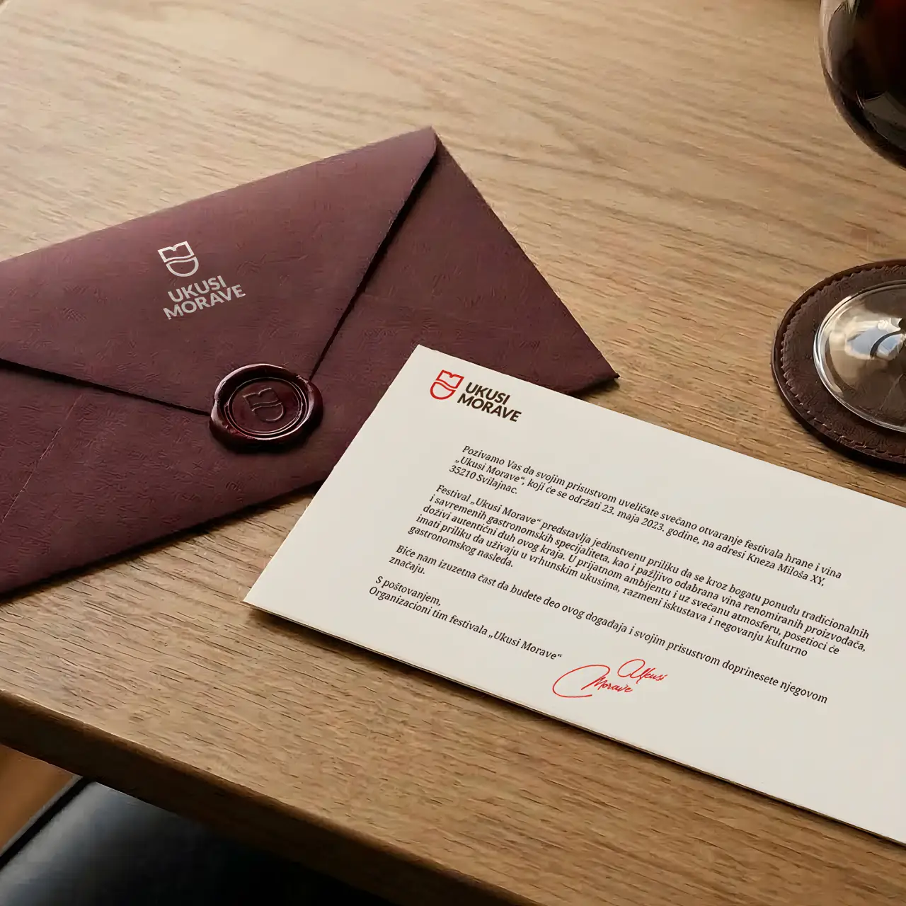

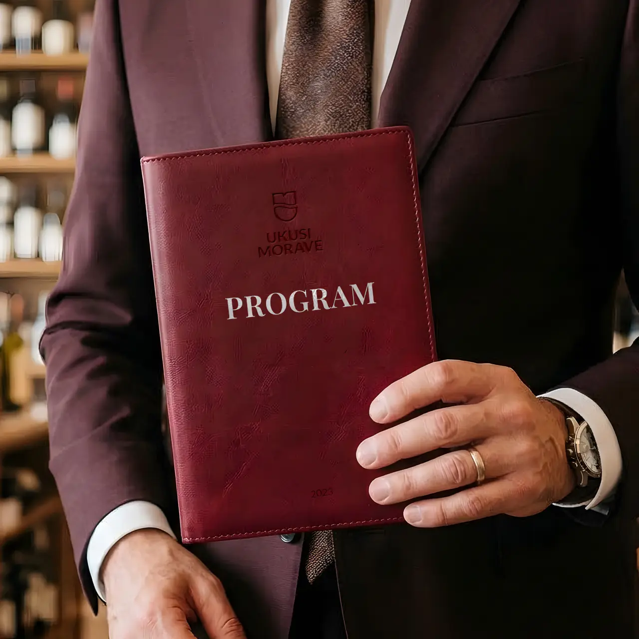
“This is where I want to be”
A carefully crafted visual identity, paired with thoughtful material choices and a more personal approach to exhibitors and visitors, creates a clear impression:
This is not just another event. This is one you want to be part of.
A different standard for how a regional event can look. And feel.